Flèche de retour à la page Portfolio

Berger

Proud of its 60 years of expertise in producing superior quality horticultural mixes, Berger chose Larouche Brand and Communications to propel its visual identity as well as its messages on a North American scale. Therefore, Larouche harmonized Berger’s graphic standards and enhanced its various key messages using simple and distinctive visual codes to create a strong, coherent, and impactful brand image. The new visual identity and messaging reflect Berger’s commitment to excellence and innovation in horticulture. The mandate also included the design and artistic direction of photos taken to represent the different imaging systems: employees, the work environment, and products.

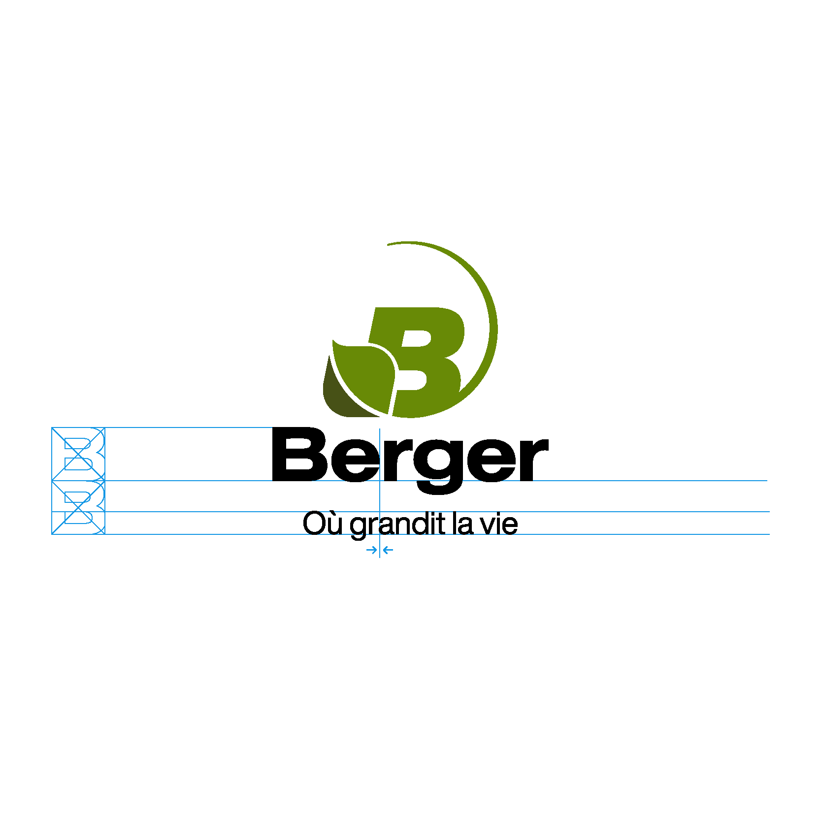
Berger logo
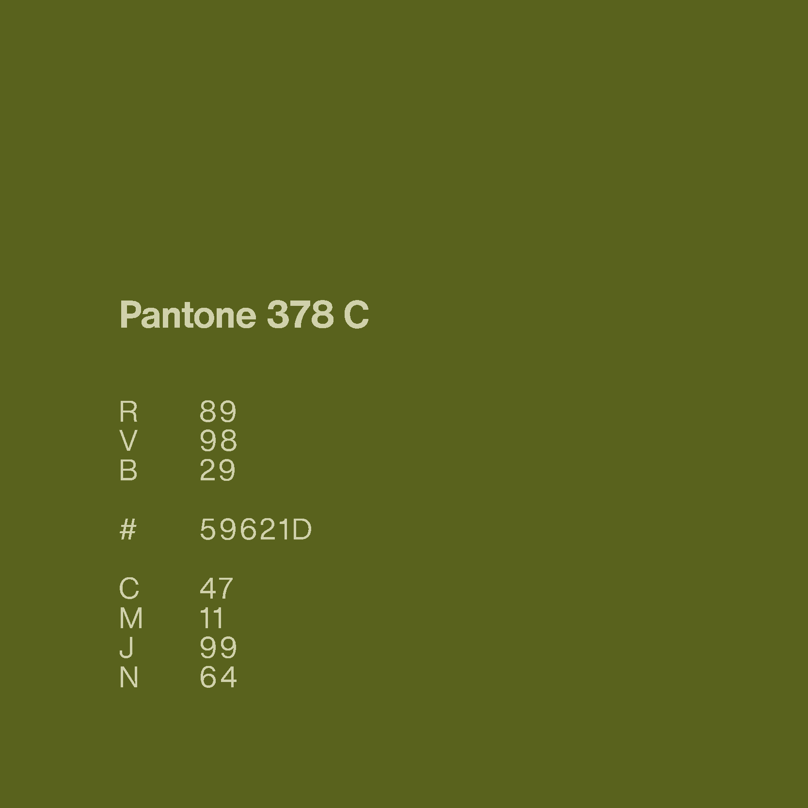
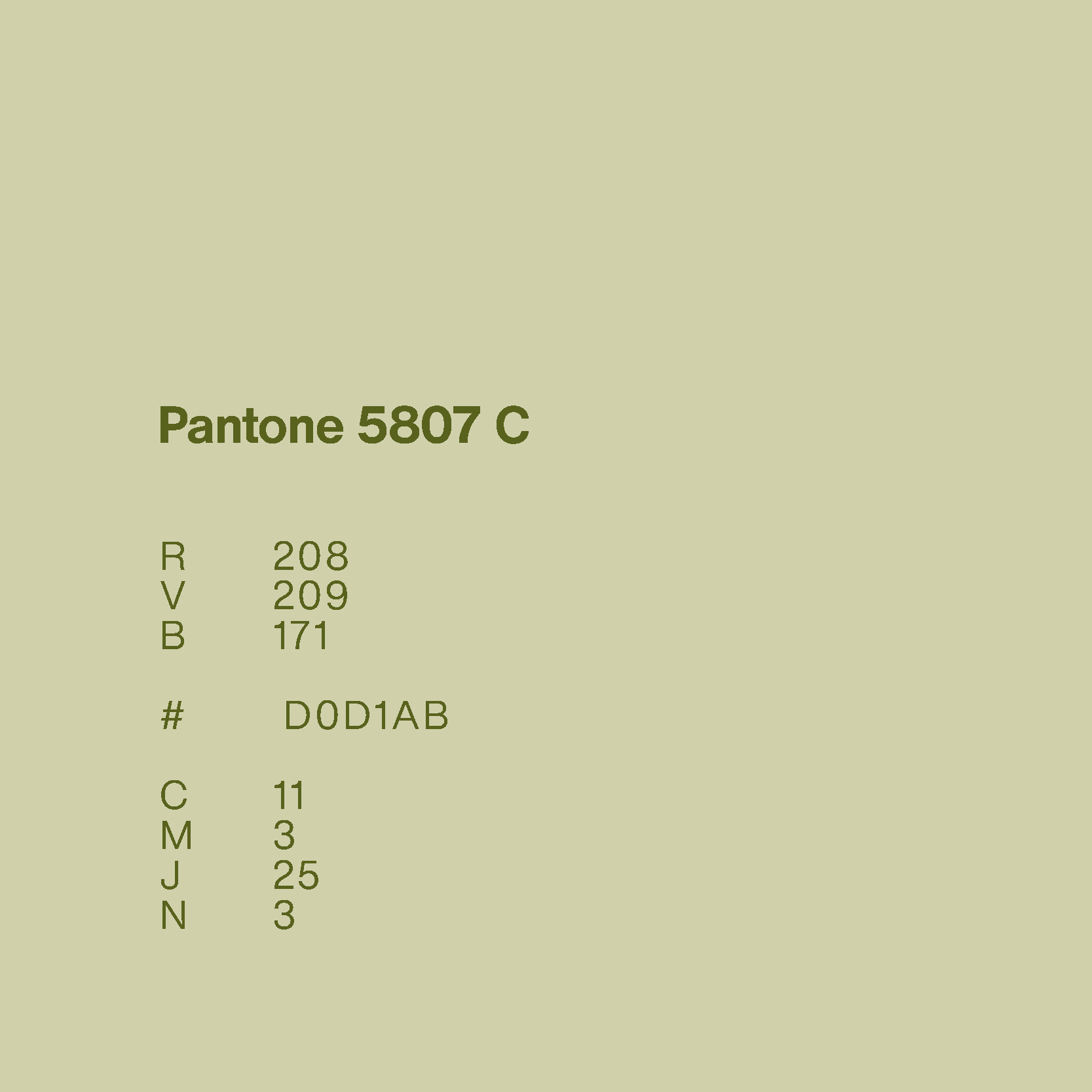
Section that shows the new greens along with their respective Pantone number
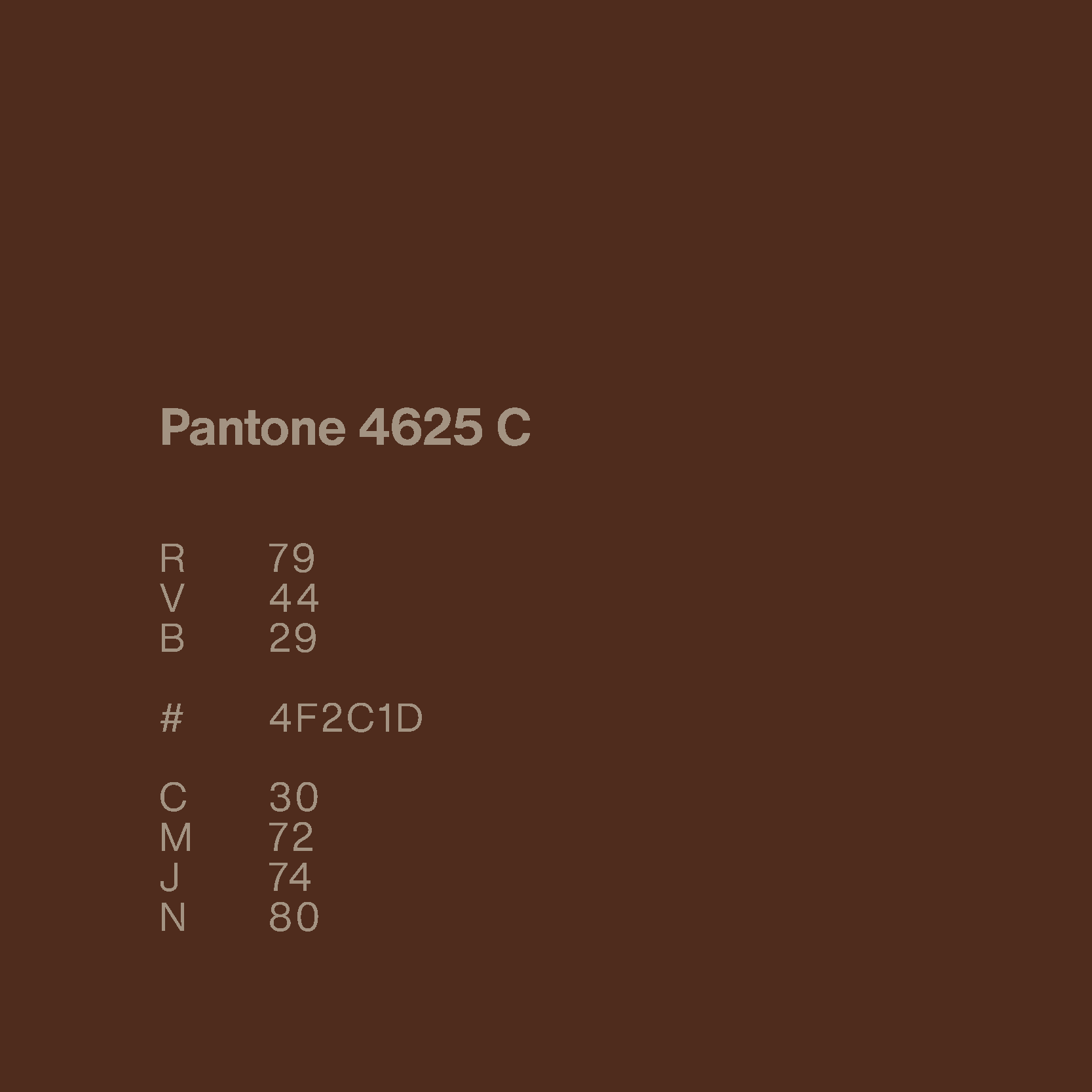
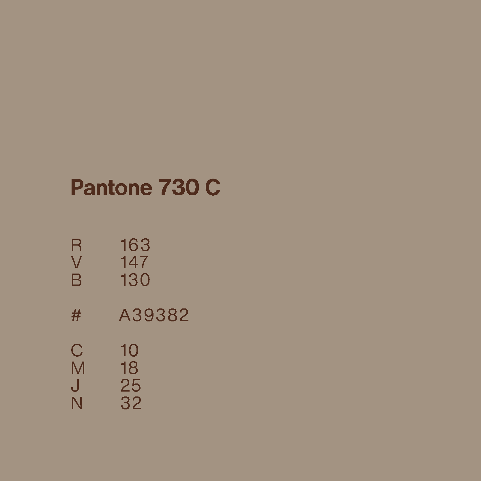
Section that shows the new browns and their respective Pantone numbers
Thin blue lines which show, in the Berger logo, the proportions between the word Berger and the positioning
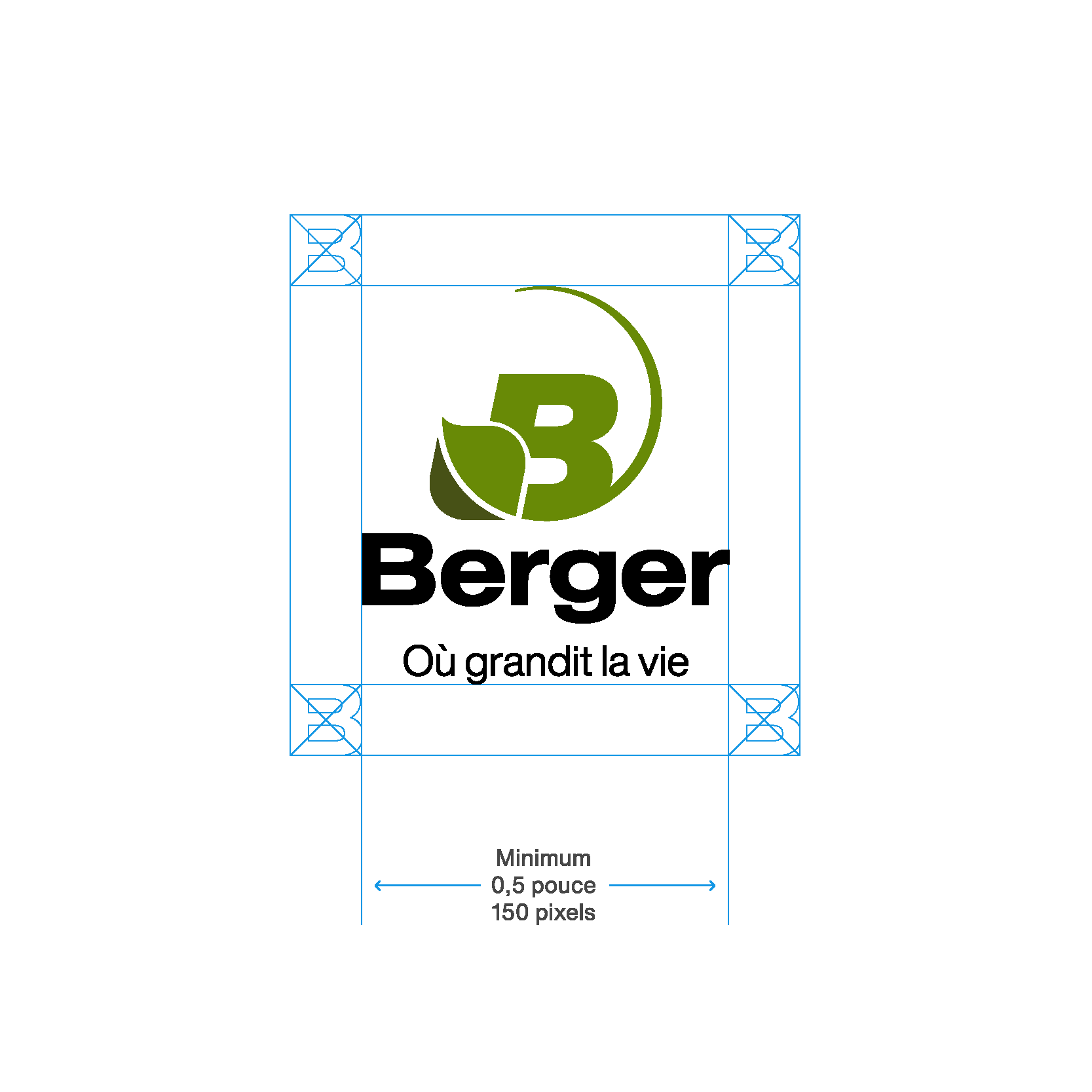
Thin blue lines which show the safety margins that must be kept around the Berger logo
Three Berger employees, 2 women and a man.
Woman holding a plant in her hands
Worker coming down from a peat moss mountain
Close-up of a man working at Berger
Close up view of a Berger horticultural mix Close up view of a Berger horticultural mix with image title : Where life grows
Image title : Where life grows
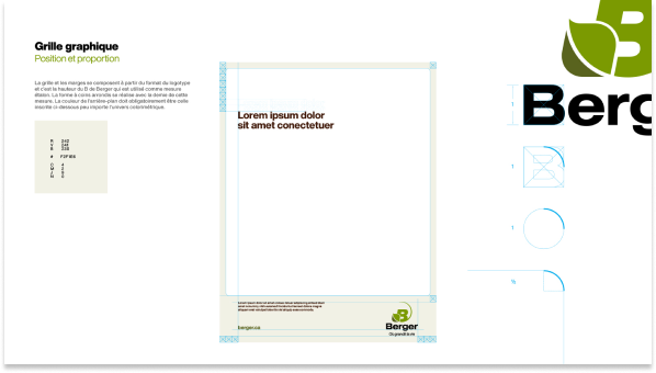
Graphic grid of the Berger logo, seen in the graphic standards document
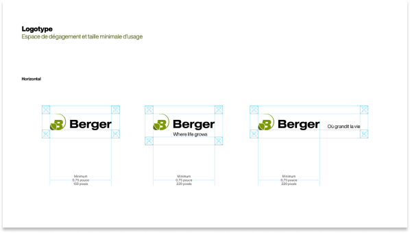
Three Berger logos showing the proportions to be respected and the positioning under and next to the logo
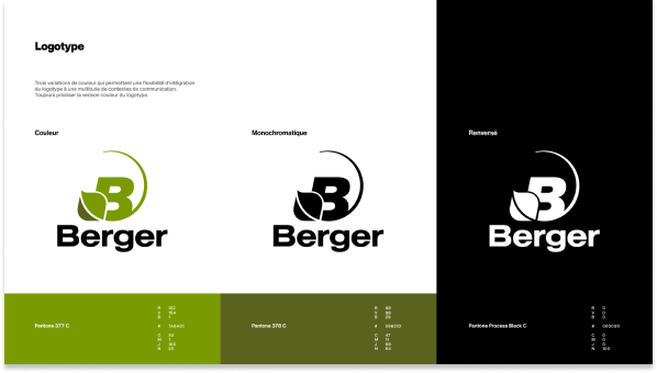
Three Berger logos: One in color, one in black and white and the other on a black background
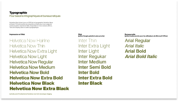
New Berger typography